The New Year is quickly approaching which means a chance to make a fresh new start for 2023 🤩

For website owners, it is the best time to refurbish their site so that it stays up to date on the latest website design trends.
In the world of web design, nothing stands out more on your website to a newcomer than its appearance. And while looks aren’t everything, having an outdated or hideous website can be an issue.
In some cases, you could lose your entire following or a customer because of how your website looks.
Luckily, you don’t have to look too hard to find new creative designs for your website.
By visiting other websites alone, you can find tons of cool website design ideas.
Of course, like most things, web designs fall out of style all the time.
To start the new year fresh, you’ll need to add new designs that are on the upward trend in the digital world.
If you need some help, here’s a glimpse at 6 of the latest web design trends that are most likely to take off in 2021 and beyond!
1. White Space in Web Designs
White space may not sound exciting, but it is one of the most effective layouts out there for many reasons.
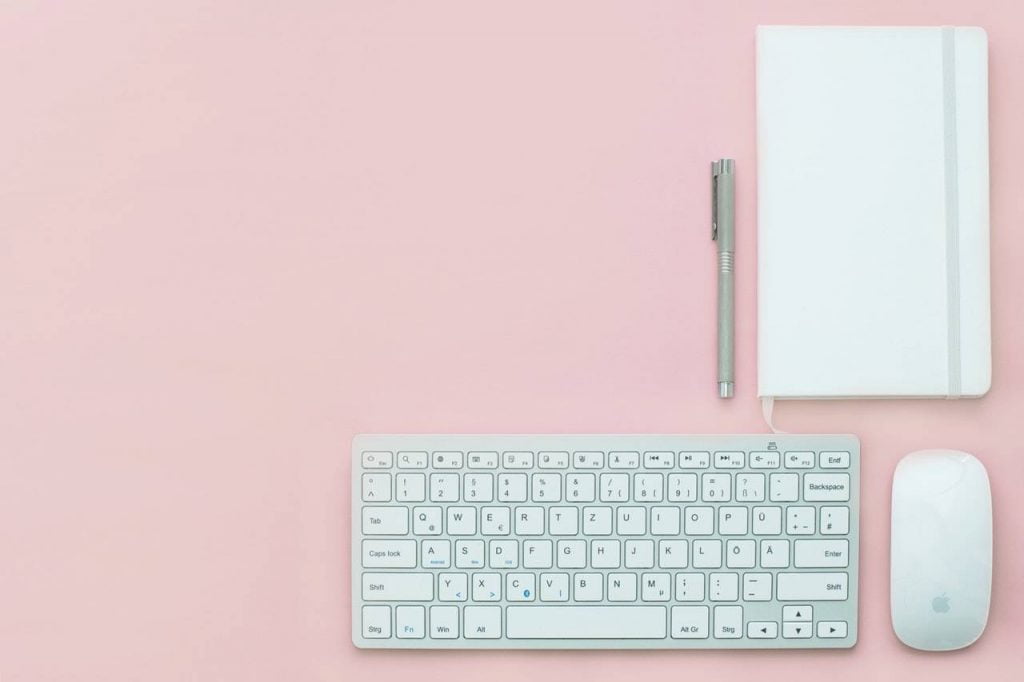
White space is the unmarked space between the elements of a webpage. This includes spaces between lines, paragraphs, graphics and other forms of content.
White space helps websites look more organized and balanced to engage viewers. Despite its name, white spaces do not always have to be white.
The term can refer to any texture, pattern, colour or image that occupies unfilled space.
Aside from its aesthetic appeal, white space also has practical functions as well.
White space can help readers stay focused and improve their rate of interaction.
In one study, white space has even demonstrated to help enhance reader comprehension. With all this in mind, it’s clear that white space won’t be going away anytime soon.
2. Voice Technology
The 2010s have marked the rise of voice technology.
Voice technologies, like Siri, has helped change the way we use our devices every day.
Today, it is possible to do things like surf the web, cook, and control the thermostat by using voice commands.
Other technologies like voice search optimization can even help websites rank for SEO.
With this in mind, it’s no wonder why search engines like Google have placed a higher emphasis on VSOs. Many predict that by 2022, voice searches will account for 50% of all searches online.
Whether that is true or not though is debatable. Since voice search technology is still new, many companies have yet to adopt it on their website.
This means there is still a chance to use it before it grows in popularity.
When it comes to deciding which web design to add to your website, you can’t go wrong with voice technology.
3. Personalised UX Design
User experience or UX, has always played a pivotal role in web development. And much like everything else, it is always changing.
Recently, many websites have put more focus on developing more personalised user experiences.
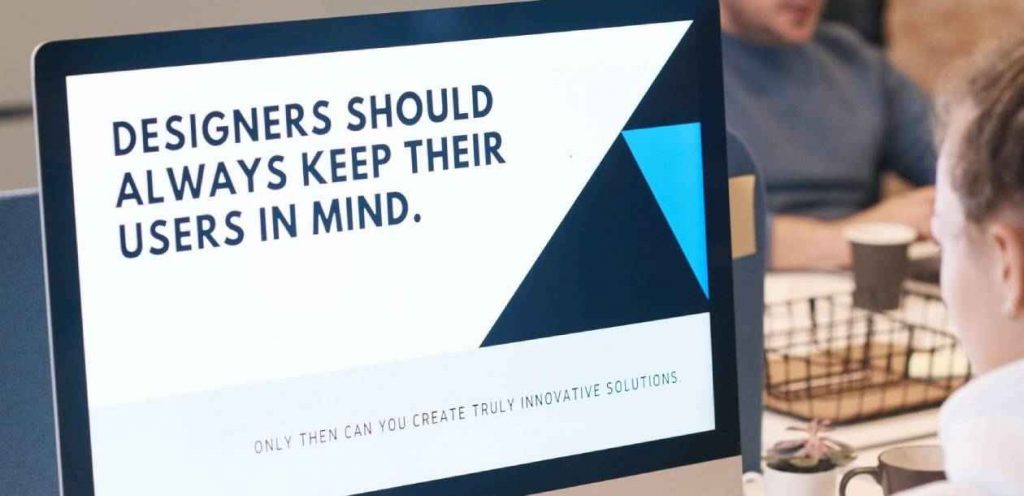
Personalised UX uses relevant content that reflects the interests of specific users. It also includes features that would allow users to interact with your site in a certain way.
To use this web design trend well requires a keen understanding of who your visitors are. It is for this reason why research is necessary before you change anything on your website.
You should also consider making your website as friendly to mobile users as possible.
Doing so will make it more likely that users will stay engaged longer on your web page.
4. Minimalist Asymmetrical Layouts
By now, you’ve may have noticed that many websites use the same grid-structured format. Whilst nothings wrong with this, using the same style for your site might make it hard for it to stand out.
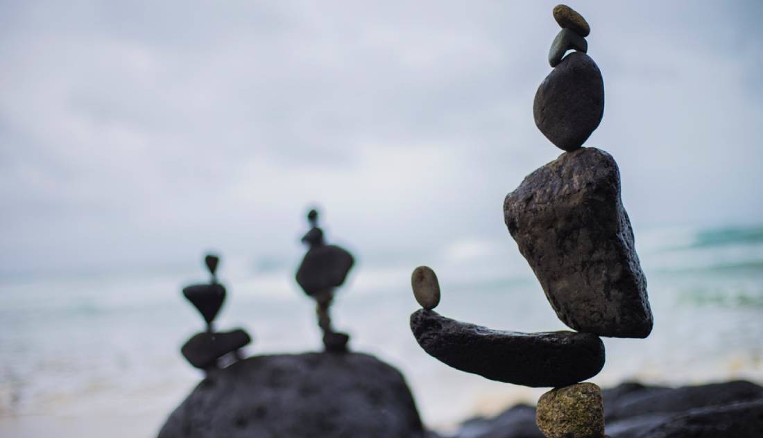
There are many layouts you can use and among them includes minimalist asymmetrical.
Minimalistic asymmetric layouts use a “less is more” approach combined with broken-grid structures.
Keep in mind that while this layout may lack symmetry, it does not mean that it is not balanced. Rather it uses irregular-sized elements to create a form of balance like the image above.
In some cases, a design element like a large image photo would rest at awkward locations next to smaller ones.
A perfect example of this would be these designs.
This layout, though, can be very difficult to pull off for many. If you’re very new to web development, you can choose to work with professional web developers.
Website builders like PageCloud for example, could also help when you’re creating styles like these.
In a world where everyone is trying the same thing, it doesn’t hurt to be a little different.
5. Dynamic Background Videos
If pictures can speak a thousand words then videos could most likely say a million words.
Video content has always been one of the most effective and trending elements used in web design.
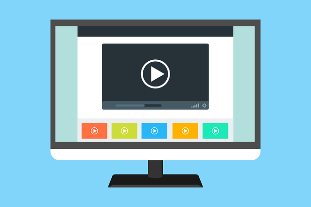
Videos have the power to attract the attention of any newcomer to your web page. Learning how to use this powerful conversion tool the right way can be tricky though.
One design element that you can use for your website is dynamic background videos.
Dynamic background videos can bring almost any website to life. Other animated web designs that you can add with this includes micro animations.
As the name says, this web design trend uses very brief but compelling animations to guide users. They are especially useful in giving out details on things like products in a way texts can’t.
Both of these design elements combined can be a very powerful asset for a website to have. But as handy as these web design elements may be, it is not meant for everyone.
There are a few things you have to consider before using this design element.
To be effective, dynamic background videos must be accurate in reflecting your brand.
If you want to make a good first impression for new visitors to your website in 2022, don’t miss out on using videos. This complete web design guide can help you plan your new or updated development. Well worth a read.
6. Saturated Colours in Web Designs
No matter where you look, we live in a world surrounded by colour.

We know, not exactly ground-breaking news. How you use colour on your website could impact how well your website will perform in 2022.
Among the most popular colour themes used on websites today include saturated colours.
Saturation describes the intensity of colours used in an image. The amount of grey that exist in a colour determines its saturation level.
The least amount of grey there is, the higher the rate of saturation will be.
Saturated colours can not only make your website more vibrant but also add character to it too.
It shows you’re not afraid to be different from other sites that use dull but safer shades and shadows.
What’s more, research has shown that colours can also affect the mood of viewers too. This is especially relevant for people like consumers when making purchasing decisions online.
Red colours, for example, are usually used a lot in elements on a website with a strong call-to-action like web hosting websites. Depending on the shade, its passionate hue is one of the first things people notice when visiting a site.
Green is a popular colour for websites that are about nature, health and sometimes wealth.
Advances in IPS technology will help colours appear even sharper on smart devices.
This will make it even easier for web owners to promote their websites for viewers on their phones. Adding a little bit of colour can bring life to any design.
Wrapping up…
And there you have it for 6 of the top website design trends that we predict will take the digital world by storm in 2022.
While we’ve only covered only a few trends on this list, keep in mind that this is only a prediction of what’s to come in 2022.
We still have yet to hear about all the new and exciting web designs that will exist during the new year.
It’s important to note that keeping your website up to date doesn’t mean using every new design trend all at once.
Instead, focus on what element works well with your brand. Doing so can help make your website the centre of attention after you’ve reigned in the new year.